Customise the withdrawal button – colour, size & position
You set the colour, shape and position of your withdrawal button yourself in seconds – without touching the embed code. Here you can see what each position looks like and how to drag the button by drag-and-drop to exactly where it fits (e.g. next to a cookie or chat window).
Recommendation: Choose an always-visible (fixed) position. From 19 June 2026 the withdrawal button must be easily accessible across the EU – a button you only find after scrolling all the way to the bottom of the page is the riskier choice for that.
Customised in 3 steps
Open your shop & “Customise colour & position”
In the dashboard, click your shop and then “Customise colour & position” (right below the embed code). You land on the widget configuration with a live preview on the right.
Pick a position or drag the button
Choose a fixed position at the top (e.g. “Fixed bottom-left”) – or simply drag the button in the preview to the spot you want with the mouse. You set colour, shape and size alongside; everything updates instantly in the preview.
Save – done
Click “Save configuration”. The change is visible in your shop within a few minutes (the embed code stays unchanged).
The positions compared
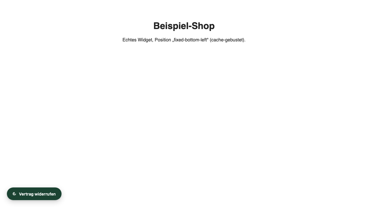
Fixed bottom-left (recommended)
Floats always visible in the bottom-left corner – no matter how far the visitor scrolls. On the opposite side of the usual chat position (right), so nothing collides. The safest way to meet the “easily accessible” requirement.
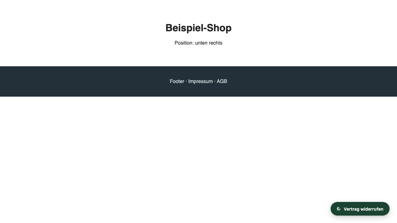
Fixed bottom-right
Same floating visibility, just on the right. Useful if your chat or help window sits on the left.
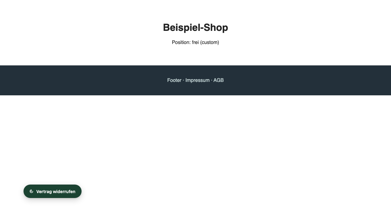
Freely positioned (drag-and-drop)
Simply drag the button in the live preview to wherever there's room – e.g. right next to the cookie banner. The button anchors edge-safe and never overhangs the screen.
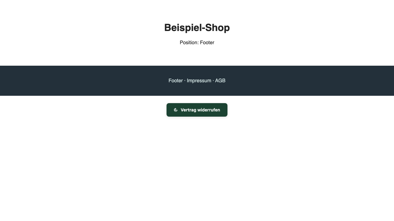
Footer (only at the bottom of the page)
Sits in the page footer and scrolls along. Caution: visitors only see it if they scroll all the way down – the riskier choice for the “easily accessible” criterion. Only pick it if the footer is embedded on every page.
Adapt colour, size & font to your shop
The button should match your shop: striking enough that customers find it immediately (the law requires it to be easily accessible and recognisable), yet in keeping with your colours. You change all settings in the dashboard under “Customise colour & position” – with a live preview that updates instantly. The embed code stays unchanged.
🎨 Colour
Set the button's background and text colour to your brand colours – likewise the colours of the form window (header, confirm button). Tip: pick enough contrast with the page background so the button stays visible.
📐 Size & shape
Padding (small / medium / large), font size and corner radius – from sharp to pill-round. Make it discreetly small or deliberately larger for more visibility.
✍️ Text & icon
Button label freely selectable (“Withdraw”, “Declare withdrawal”, “Withdraw from contract” …) and the icon can be switched on or off. You can adapt the texts in the form too.
Good to know: During your 14-day trial – and on the Solo, Shop and Agency plans – custom colours, your own branding and removing the “Powered by” notice are fully unlocked. Go ahead and try it: you have these premium features for free right now.
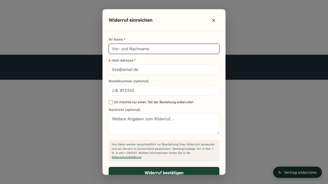
What your customers see
A click on the button opens the two-step withdrawal form (identification via email, username or customer number, the contract designation, and optionally an email for the acknowledgement of receipt) with a GDPR notice and the legally required confirmation step.
Customise your button now
Sign up, open your shop and drag the button in the live preview to the spot you want. Start free.
Go to dashboard